Call for applications
THE DRAWING INCIDENT: Open Studios & Symposium on Drawing
Sint-Lucas Visual Arts Ghent
Zwartezustersstraat 34
9000 Ghent
Belgium
Phone: 0032 (0) 9 225 40 90
Contact: Ans Nys ans.nys@kunst.sintlucas.wenk.be
www.kunst.sintlucas.wenk.be
21-25 September 2009
Application deadline: 25 August 2009
THE DRAWING INCIDENT
Drawing may be the most direct way to materialize vision in a work of art. One simply makes a mark and then another one in relation to that first mark, etc. This instant way of constructing an image makes drawing a transparent medium: the drawing shows its evolution, its mistakes, accidents and incidents, what happens in the margin. Like William Kentridge puts it: 'Often, as a drawing proceeds, interest shifts from what was originally central, to something that initially appeared incidental.' This quality of openness to the unforeseen, the uncontrollable, the unconscious, is widely acknowledged and appraised by artists and critics. The question is how to create the conditions to let this quality flourish and to lead the drawing (process) to a coherent and striking whole.
The Drawing Incident is a one-week event on drawing with open studios, artist's talks and a concluding symposium. It offers artists the opportunity to create and discuss new work in an open studios setting. Each studio is lead by an internationally known artist, for whom drawing is an important artistic means or thinking tool. Artists are Benjamin Verdonck (BE), Sonia Boyce (UK), Wendy Morris (SA/BE), Kenneth Andrew Mroczek (USA/BE). Each studio is designed around a specific focus on contemporary drawing, starting from the artistic practice of the invited artists. Every morning starts with an artist's talk by one of these artists. On Monday evening Norman Bryson (USA) will give a keynote lecture.
On Thursday evening the participants will present their new work in the studios. The public opening of the participants' exhibition will coincide with the opening of an exhibition with work by the 4 invited artists at the Witte Zaal.
On Friday the 25th a symposium – open for a broader audience – concludes The Drawing Incident with artist lectures by Kelly Chorpening, Evert Defrancq, Voebe de Gruyter, Rebecca Fortnum, Tania Kovats, Ed Krcma, Peter Morrens, Dirk Zoete. During this symposium the new artist journal Th Ink will be launched.
PROGRAM
Monday 21 September – 7 pm
Opening keynote Norman Bryson open to all free access
Monday 21 – Thursday 24 September – 9 am > 5 pm
Open Studios by application fee: 100 EUR
Thursday 24 September – 7 pm
Open Studios presentation & Opening at the Witte Zaal open to all free access
Friday 25 September – 10 am > 5 pm
Closing symposium open to all entrance: 5 EUR
APPLICATION
To apply for the 4-day Open Studios please send your motivation to participate and collaborate with one of the artists together with one or more e-links or a digital portfolio in pdf with current work to: thedrawingincident@kunst.sintlucas.wenk.be.
Do not forget to mention the name of the artist you want to collaborate with (Benjamin Verdonck, Sonia Boyce, Wendy Morris or Kenneth Andrew Mroczek). For more information about each studio please download the pdf on the website: www.kunst.sintlucas.wenk.be > nieuws en agenda.
Application deadline: 25 August 2009
Participation fee: 100 euro for the 4-day open studios and symposium.
To book for the symposium on Friday only, please e-mail to sabine.demeester@kunst.sintlucas.wenk.be.
Places are limited so you are encouraged to book early.
The Drawing Incident is a new initiative of the Drawing Research group at Sint-Lucas Visual Arts Gent. Sint-Lucas university college, one of the leading art colleges in Belgium, offers bachelor's and master's courses in visual arts and design and is a member of the Association of the Catholic University of Leuven.
The Drawing Research group was formed to stimulate reflection upon drawing, through practice-based research and writing. It is their aim to organize on a regular basis symposia and workshops on drawing, as well as to develop other projects, as the new artist journal Th Ink. Traditionally, drawing has been a major point of interest in Sint-Lucas Visual Arts in Ghent, resulting in flourishing ateliers in a.o. graphic arts, illustration, painting, graphic design.
lundi 20 juillet 2009
mercredi 8 juillet 2009
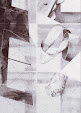
Robert Mangold
 Robert Mangold, Double Line Column Study, Pastel-pencil on Paper, 76.2 x 57.2 cm, 2005, Galeria Elvira Gonzalez.
 Robert Mangold: Drawings and Works on Paper, 1965-2008, catalogue PaceWildenstein Gallery, essay by Robert Storr, 2009.
 « "Robert Mangold: Drawings and Works on Paper, 1965-2008" (PaceWildenstein March-April, 2009) is a historical survey exhibition of nearly 100 drawings and works on paper from the artist’s personal archive, most of which have never before been exhibited. This exhibition offers a unique opportunity to examine over four decades of Mangold’s work, and the works on view range from preliminary studies to fully worked drawings and paintings on paper. Colored pencil diagrams made in preparation for the Wall paintings from the 1960s and the distorted circle and square compositions from 1972-74 as well as studies for the X, Plus, and Frame series from the 1980s, Irregular Areas (1985-87), Tilted Ellipses (1990), the complete Attic Series I–XVIII (1990-91), Plane/Figures, Curved Plane/Figures and Zones from the 1990s, Curled Figures (2000-02), Columns (2002-06) and Column Structures (2006-08), and his most recent series Ring Images (2007-present) highlight the artist’s cyclical and self-referential vocabulary. When viewing the drawings side by side it becomes apparent that Mangold’s early works inform his late works and vise versa. After visiting the artist’s upstate studio and observing a group of drawings pinned directly to the wall in no specific chronological order, Robert Storr wrote, “[it is] as if the readily apparent themes and variations Mangold has worked with over the years were suddenly allowed to interrupt and intersect with each other like overlapping components of a larger orchestral work.”
 Robert Mangold. Column Structure Paintings 2007, catalogue PaceWildenstein Gallery, essay by Richard Shiff, 2007.
In 1965, while working on his painting Red Wall, measuring only 2" in depth, Mangold recognized that in order to achieve the “flat frontality” he was striving for his work needed to maintain a direct relationship with the wall, an idea he termed “limited depth”. It was then that Mangold fully embraced paper, recognizing how the thin, flat nature of this medium achieved the desired effect with the wall and allowed his images to be seen instantly, in their entirety.
 Working on paper also gave Mangold the freedom to explore material, shape, line and color and to continually reinvent ways in which these components relate to each other. His drawings represent both an individual and collective unit, and as Mangold has stated, he rarely conceives of a single work, choosing instead to approach an idea again and again, with related groups developing.
Robert Mangold strives to find equilibrium between his colorful, monochromatic planes and the hand-drawn figures. He produces studies to scale in an effort to work out any differences between the two until a symbiotic balance is achieved. Storr emphasizes the importance of the hand drawn elements in Mangold’s work: “Mangold is preeminent among those who choose to do it the hard way – by hand. However, he does not fetishize touch in the manner of expressionists and others who make the artist the overt or covert subject of their work by stressing their emotional and physical presence at its creation. Nor does he foreground the difficulty of the task he assigns himself or ever let the exertions it requires show in the final work in order to highlight his virtuosity.” »

Robert Mangold, Untitled - Split Ring, Pencil on canvas, 35.6 x 35.6 cm, 2008, Mark Borghi Fine Art, New York.
Bernard Guerbadot

1999, exposition à l’ENAD Limoges, lithographies rehaussées et peintures sur papier.
« Bernard Guerbadot était de ces êtres rares qui accompagnent la vie de ceux qu'il a croisé au delà de la rencontre, et aujourd'hui malheureusement, au delà de sa vie. Car il savait faire advenir les choses, ouvrir nos regards au monde et nous permettre d'y puiser notre matière et notre richesse : une certaine façon de se déprendre de l'ordre des choses. » Extraits du texte que Philippe Cyroulnik (directeur du 19, CRAC de Montbéliard) a lu au cimetière de Gondecourt.
« […] Bernard Guerbadot (1948-2005) assume ce qui détermine, pour chaque œuvre, son mode propre d’exposition, entre suspens, conformation au plan mural (le plâtre noir et brun de 1997), soclage (le plâtre quadrilobé noir de 2003) et clipsage sur des plots (le dessin de 2002).


Bernard Guerbadot, Sans titre, relevé à l’encre de Chine sur papier, 80 x 120 cm., détail, 1979-97.
« Bernard Guerbadot était de ces êtres rares qui accompagnent la vie de ceux qu'il a croisé au delà de la rencontre, et aujourd'hui malheureusement, au delà de sa vie. Car il savait faire advenir les choses, ouvrir nos regards au monde et nous permettre d'y puiser notre matière et notre richesse : une certaine façon de se déprendre de l'ordre des choses. » Extraits du texte que Philippe Cyroulnik (directeur du 19, CRAC de Montbéliard) a lu au cimetière de Gondecourt.
« […] Bernard Guerbadot (1948-2005) assume ce qui détermine, pour chaque œuvre, son mode propre d’exposition, entre suspens, conformation au plan mural (le plâtre noir et brun de 1997), soclage (le plâtre quadrilobé noir de 2003) et clipsage sur des plots (le dessin de 2002).

Cette dernière œuvre de Guerbadot me semble pousser dans ses ultimes conséquences la logique d’intégration des appareils d’exposition amorcée par Robert Ryman dans les années 1960. Il le fait au nom de l’œuvre et en sa faveur, à l’instar de Daniel Dezeuze, Richard Tuttle ou Christian Bonnefoi, quand une autre possibilité fut d’exposer l’appareil d’exposition pour lui-même (Daniel Buren), avant que l’exposition comme genre et médium ne s’établisse aujourd’hui pour beaucoup comme un lieu commun. Dans le dessin clipsé, les plots reprennent précisément les contours internes du dessin. Ils sont à la fois déterminés par la nécessité de trouver un moyen de tenir l’œuvre au mur et déterminants pour la perception tendue que l’on a du dessin en avant de la paroi, dont la qualité de blanc a été appliquée sur les plots. Ainsi ces plots apparaissent-ils comme des éléments muraux en ressaut où vient se clipser le dessin, qui impose au regard une sensation de totalité intégrant désormais aussi ces plots comme participant à la fois de l’intégrité de l’œuvre et de ses franges extérieures (bien qu’internes).
Ce souci accordé à l’intégration du mode d’exposition tient d’abord à une nécessité : comment exposer un plâtre ou un dessin mis en forme, quand de surcroît chaque choix (socle, suspens, plots, conformation au plan mural) infléchit la forme et la perception de l’œuvre ? »
Ce souci accordé à l’intégration du mode d’exposition tient d’abord à une nécessité : comment exposer un plâtre ou un dessin mis en forme, quand de surcroît chaque choix (socle, suspens, plots, conformation au plan mural) infléchit la forme et la perception de l’œuvre ? »
Tristan Trémeau, “De brefs déplacements”


Bernard Guerbadot, Sans titre, dessin sur papier et kaolin, 28,5 x 27,5 cm, 2000.
« […] l'artiste n'intervienne pas seulement en surface de [la matière] mais à l'intérieur même de sa corporalité. Le pigment n'est donc plus déposé par l'artiste sur une surface, par couches successives, selon un principe additif de recouvrement. Il est incorporé au cœur même de la matière et les flux migratoires sont favorisés par l'intervention recto-verso sur l'épreuve. En intervenant également au dos de la feuille, cela permet d'évacuer le concept de support au profit de celui de surface où la matière devient support de sa propre couleur. Les formes, elles mêmes, sont moins le produit d'une suraccumulation sédimentaire de matières, de pigments, que la manifestation réactive de l'ultime surface où s'opère les transferts, les intégrations et les métamorphoses physico-chimiques des matériaux. En ce sens cette surface devient le lieu de l'expérience. Or ce lieu tient plus de la causalité que du topos. Faudrait-il encore pouvoir dissocier l'un de l'autre.
Lorsque Bernard Guerbadot stimule la migration du matériau, il la met également en parallèle à celle de l'esprit qui la porte, non en ce sens que l'esprit la formalise, mais plutôt qu'il s'en imprègne dans un même élan. Ces migrations, ces contagions ou résonances se multiplient dans l'espace et se diffusent dans, au travers, et par la surface […] le visible ici tient moins du vestige d'une action ou d'un geste révolus, comme il en est des œuvres de Franz Kline, mais bien du processus actif d'échange, de mutation, d'ingestion ou d'absorption des substances. C'est donc moins la condensation d'un moment intense devenu inerte, qu'une durée à travers laquelle tout s'inaugure et se met en œuvre à chaque fois que le regard s'y plonge. Il y a de la durée. Il y a de la suspension. En somme des tensions dynamiques. Chaque diffusion s'inventerait sous notre regard, tout en mêlant le tangible et l'ineffable.La série des ces dessins recèle une portion temporelle active. Celle de l'expérience migratoire des flux où le matériau se livre alors sans plus aucune retenu. Il n'est pas pour autant question d'animisme. Mais bien d'une explosion des possibles à travers la chimie des corps mêlés, à travers également une alchimie où la migration teinte l'œil puis sa rétine, pour se propager, pour s'étendre au cœur même de celui qui met l'œuvre à jour […] »
Olivier Beaudet, “Bernard Guerbadot : les résonances d'un effet papillon”

Bernard Guerbadot, Sans titre, relevé à l’encre de Chine sur papier, 80 x 120 cm., détail, 1979-97.
mardi 7 juillet 2009
Fred Sandback

Fred Sandback, Untitled (Fourth of Ten Corner Constructions), 1983, maroon and black acrylic yarn. Kettle's Yard Gallery.
Fred Sandback : Commentaires sur ma Sculpture 1966-86
« En 1966, je me suis retrouvé impliqué dans une sorte d’assemblage de pièces dépareillées de facture industrielle, reliées en série. L’interrelation chantante des pièces n’était ni énergique ni convaincante. En réponse à mes complaintes au sujet de la sculpture en général, et de l’incohérence de la mienne en particulier, George Sugarman a dit quelque chose dans ce sens : « Eh bien, si tu en as marre de toutes ces pièces, pourquoi ne pas faire juste une ligne avec une pelote de ficelle et puis c’est tout ? »
La première sculpture que j’ai faite avec un morceau de ficelle et un bout de câble était le contour d’un solide rectangulaire – un 2" x 4" – posé sur le sol. C’était un acte sans signification particulière mais qui semblait m’ouvrir un grand nombre de possibilités. Je pouvais imposer une certaine place ou un certain volume dans sa totale matérialité sans l’occuper et l’assombrir.
Je pense que ma première attirance vers cette situation était la façon dont cela m’a permis de jouer avec quelque chose qui à la fois existait et n’existait pas en même temps. La chose elle-même, le 2" x 4" – était aussi matérielle que possible – un volume d’air et de lumière au-dessus de la surface du sol. Néanmoins ma manière de la façonner, la forme et la dimension de cette œuvre, avait une qualité ambiguë et éphémère. C’était également comique – elle avait une qualité anecdotique du genre « d’abord il y a une montagne, puis il n’y a pas de montagne, puis il y a ... » mais à l’envers.
%2520ca%25201977)%2520vertical%2520view%2520ecopy_web.jpg) Fred Sandback Untitled (Diagonal) 1970/1996, black acrylic yarn (single strand). As installed: 142 x 87 x 238-3/4 inches. Zwirner & Wirth, New York
Fred Sandback Untitled (Diagonal) 1970/1996, black acrylic yarn (single strand). As installed: 142 x 87 x 238-3/4 inches. Zwirner & Wirth, New YorkÀ ce moment-là, je n’avais pas une série d’objectifs bien définis. En fait, je veux faire de la sculpture – et je suppose que c’est intéressant – je n’ai pas tiré une grande inspiration de la peinture américaine des années 50 ou au moins presque pas autant que des sculptures plus anciennes. J’ai passé un été à tenter tous les jours, sans grand succès, de dessiner les esclaves de Michel Ange.
Quand j’ai fini par rassembler mes premiers morceaux de ficelle, ce n’était pas tellement, rétrospectivement, parce que je voulais faire de la sculpture sans composition de pièces, ou sans espace positif et négatif, mais plutôt parce que je voulais juste faire de la sculpture et ces choses-là semblaient tout simplement m’en empêcher.
Pourtant, dès le début, je sentais dans mes tripes le désir de vouloir être capable de faire de la sculpture qui n’avait pas d’intérieur.
Sinon, si l’on pense à la nature du lieu ou à un lieu – le fait que je sois là avec ou dedans – et à la nature de l’interaction entre les deux était intéressante. Et à ce moment-là, le penser était peut-être plus intéressant que le faire, même si naturellement c’est ce dernier qui a maintenu mon intérêt. […]

Fred Sandback, Blue Day-glo Corner Piece, 1968/2004 1/32" Elastic Cord & Spring Steel, 14 x 12 x 6 inches. Barbara Krakow Gallery.
Les lignes droites ont tendance à être perçues comme puristes et géométriques, et l’on m’a constamment conseillé de me « détendre » comme lorsque Spoerri me prescrivait de grands bols de soupe aux lentilles pour me guérir de mon puritanisme fanatique. C’est parce que je veux le volume de la sculpture sans la masse opaque que j’ai les lignes. Ce sont plus ou moins de simples faits cependant, et non des exemples d’une géométrie ou de tout autre ordre plus grand. C’est simplement ce que fait la main.
La ligne est un moyen de modifier la qualité ou le timbre d’une situation et elle a une structure qui est rapide et abstraite et plus ou moins concevable, mais c’est la tonalité ou, si vous voulez, l’intégrité d’une situation qui est ce vers quoi je tends. Mes intrusions sont généralement modestes, peut-être parce qu’il semble que c’est ce premier moment où les choses commencent à se fondre ensemble qui est intéressant. […] »
Fred Sandback, 1986. Publié en premier dans Fred Sandback, Sculpture 1966-1986 (Mannheim : Kunsthalle 1986).

Fred Sandback : Being in a Place, Fred Sandback, Friedemann Malsch, Christiane Meyer-Stoll, Yve-Alain Bois, Thierry Davila, Ostfildern, Germany : Hatje Cantz Publishers, 2005 ; exhibition catalogue ; partial cloth over pictorial boards ; offset-printed ; sewn bound ; black-and-white & color ; 26 x 21.5 cm. ; 296 pp.
"To transform space into a sculptural material has been a modernist obsession ever since Picasso created a virtual plane, by sheer structural opposition between void and full, in his 1912 Guitar (MOMA). The concept of "drawing in space" elaborated by Gonzalez and adopted by so many sculptors in the immediate postwar era is the logical extension of this early experiment. But how many artists could carry on the task? The reason it is so difficult – as diagnosed by the brilliant Constructivist sculptor Katarzyna Kobro – is that space is unlimited, and if one wants to shape space as such (and not an ersatz space) one must retain this unlimited quality. Or, to follow Kobro's analysis again, as long as one places a figure within space, space is absorbed by the centripetal force of the figure, which acts like a black hole. Sandback intuitively understood this dilemma, which is why he conceived of his rectangles, trapezes, squares, etc., as evanescent, intangible slices of space whose limits are only to be mentally completed: As soon as these geometrical figures coalesce in front of our eyes, they disappear again at our slightest motion. We dare to pass through the thresholds, but this leaves us panting, and we immediately busy ourselves reconstructing the dissolved rectangles or trapezes. For a generation of sculptors so concerned with the intensity and forming power of one's perception, none exacerbated that intensity with such economy, efficaciousness, or elegance."
World and a string: Yve-Alain Bois on Fred Sandback. ArtForum, Oct, 2003.
lundi 6 juillet 2009
Lia Perjovschi, Knowledge Museum

Lia Perjovschi, Knowledge Museum. Body Mind Map, 2007.
Lia Perjovschi, INTERVAL: Plan (for Knowledge Museum)
“The belief in ideals, in the realization of dreams, as well as in the function of art in increasing knowledge, is one of the most important characteristics of Lia Perjovschi's artistic practice. With the Plan for a Museum of Knowledge, she proposes an imaginary museum, which is based on the metaphors of the Body, the Earth and the Universe. The Museum of Knowledge is characterized by an interdisciplinary approach, the positioning of art within a changing system of relations. The museum as an open-structure archive shifts the focus from the spectacle to the learning process. More than an idea, the plan in the title seeks to emancipate the viewer, and is to be looked on as a conscientious vision.
The installation, which comprises drawings, objects, charts, photos and colour prints, is an objectification of the mass of information the artist has acquired through reading, travelling and creative work. The 'mental map' thus created offers a view into those processes of selection that define the artist's attitude towards the world, her methods of associating things, of building her own understanding of the world.”
Dorottya Gallery, Budapest, Hungary
http://mucsarnok.hu/new_site/index.php?lang=en
Lia Perjovschi. Born in Sibiu, Romania in 1961. She lives and works in Bucharest. She started her career with drawings and performances. Her activity as a collector and operator of the CAA / CCAA (Contemporary Art Archive / Contemporary Centre for Art Analysis) is informed by a sense of social responsibility and commitment to independent thought, the need to create contexts and to reassess history. Recent individual shows: Statement, Pavilion Unicredit, Bucuresti (2009), Lia Perjovschi: performances 1987 – 2007, Wilkinson Gallery, London (2008), States of Mind, Nasher Museum of Art, Duke University (2007), Kunstraum Innsbruck Projectroom (2006), Endless Collection, Goppingen Kunstverein (2003). Group shows: A.C.A.D.E.M.Y, MuhKA Antwerpen, (2006), Again for Tomorrow at Royal College of Art London (2006), Interrupted Histories, Museum of Modern Art Ljubljana (2006), On Difference, Württembergischer Kunstverein Stuttgart (2005).

Lia Perjovschi, Timeline (la période du modernisme), fragment 2, 1997.
« Dan et Lia Petrovitch retracent sous forme de réseau complexe une cartographie de la genèse de Dada. Ce travail découle d'une recherche intitulée CAA/AA (Archives de l'art contemporain / pour l'analyse de l'art) et se prolonge à différents endroits. Toujours en marche, il est compilé dans des classeurs, présenté dans un scriban en carton ou encore étalé sans ordre. Les éléments disparates sont étiquetés et protégés — restes de vie, documents de recherches, et réels objets d'histoire, chacun trouve sa place dans ce travail monumental et minutieux de conservation, mis à notre disposition. »
http://www.paris-art.com/art/critiques/d_critique/Mircea-Cantor-Irina-Botea-Dada-East-Contextes-roumains-du-dadaisme-5547.html
 Dan and Lia Perjovschi, States of Mind
Edited by Kristine Stiles. Catalog of the art of Dan and Lia Perjovschi.
Their art is of singular significance in the development of experimental art in Romania since the late 1980's. The Perjovschis' work matured under the double pressures of Romanian socialism and Soviet communism. Both artists forged original and challenging forms of visual expression in drawing, performance, installation, and conceptual practices, as well as in the analysis and use of mass media (especially television and newspapers).
August 2007, Publication of the Nasher Museum of Art at Duke University Press, 224 pages, 310 illustrations (including 180 in color).
Inscription à :
Articles (Atom)